Serck is a dominant supplier in international heat exchange covering applications of all sizes, from race cars to mining machines. With more than 100 years covering the full range of heat transfer needs for their clients, Serck is a big name with powerful brand equity. Despite this, their branding was lacking consistency. Different styles were used in various divisions, and there were no guidelines and templates to help keep branding uniform across the business.

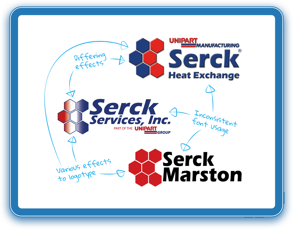
While brand recognition and equity were strong for Serck, consistency was their biggest issue. Throughout Serck there were a number of different styles being used in their marketing materials. Everything we looked at, both digital and printed literature, had inconsistent brand aspects, from typography to palette and visual cues.
One logo would have the corporate colouration of Unipart with a bevel and emboss with drop shadow effect, while the next logo was a flat design dropping the Unipart blue, and instead, going for a simple black and red combination.
Font usage was another of the key challenges. Over the different logos, the same font was used — “Marta-Bold” — but it was displayed in a multitude of colours with various degrees of ‘slant’.

MissionModernise the Serck brand, while retaining the brand equity and overall visual tone of their existing branding. Then, ensure branding materials are used consistently across divisions, with templates and guidelines for easy adoption.
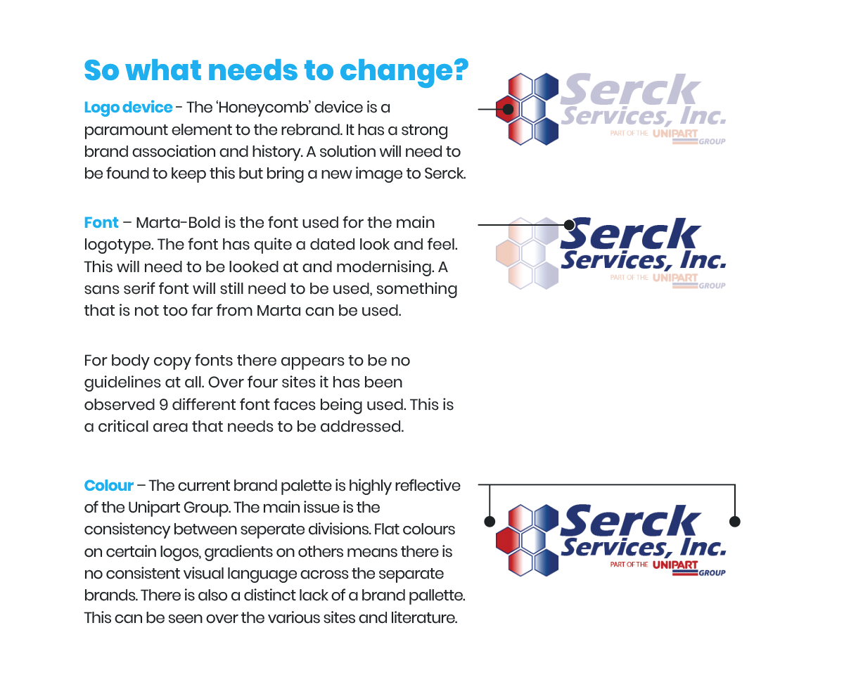
While we wanted to keep the overall tone of Serck’s existing brand, the font aesthetics were a little old fashioned and in urgent need of a modern revamp. We had to ensure that the new branding was still recognisable and retained their brand equity but also worked alongside the Unipart branding.
Rather than a complete brand revolution, we opted for a thorough brand evolution.
We identified the ‘Honeycomb’ device, that harks back to the original early 20th-century radiator design, as a key brand element that we needed to preserve in Serck’s new branding. This element was the thread to retain their existing brand recognition and not appear as something brand new or similar to one of the many brands using historical Serck brand elements.
Aged elements of the brand – fonts, effects and composition – were identified to be modernised and brought up to date. At the same time, brand elements were to be brought together to reflect the same image, association and demonstrate that they are all under the same umbrella.
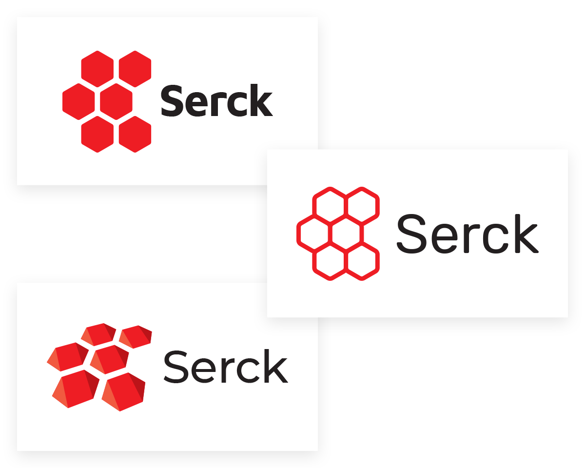
With our goals in mind, we produced three concepts to present to Serck. Version 1 was a modernisation on the current logo. Version 2 took it a step further, and Version 3 was a far more creative approach. Each version presented had its own font sets and colour palette.
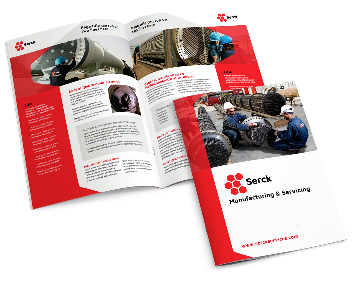
From the solutions presented, Version 1 was selected: a modernisation on the current logo. Using this new modern logo, brand guidelines were created, and digital and physical assets, such as brochures, marketing literature, PowerPoint and Word templates, were designed to ensure staff could easily populate and share while keeping in line with the new brand guidelines.
Thrilled with the new look and feel of their branding, Serck has since had us go on to create an entire suite of new brand assets.
WHAT THEY SAYThe team at Urban Element were great at bringing together many very different ideas on what the visual identity of the business should or could be, and uniting us around a global option that works well for our existing business and that will serve us well as we grow in the future.
Jennifer Watkiss - Serck

