
The Fundamentals of Website Design
07/01/2019 | Web Design | 5 minutesWhen having your website designed there are a few fundamental rules that you want to keep in mind to get the most from your online presence.
Design the site for your audience, not just your personal tastes.
Often a business will have an idea of what they want their site to look like. This can be a good thing and a bad thing – as often businesses have an impression of what THEY would like to see, rather than considering what their potential site visitors would be looking for.
It’s therefore important to know your audience and who you are trying to appeal to. There is no use having a website that is all singing and dancing, with animations popping in and out if you are a serious legal agency, nor is there any sense in making yourself look like you are a huge multinational company when you are actually a one man band and can only handle a few local clients at a time. Put yourself in the users shoes and think about what they would like to see, what they would like their experience to be and how you convey your business.
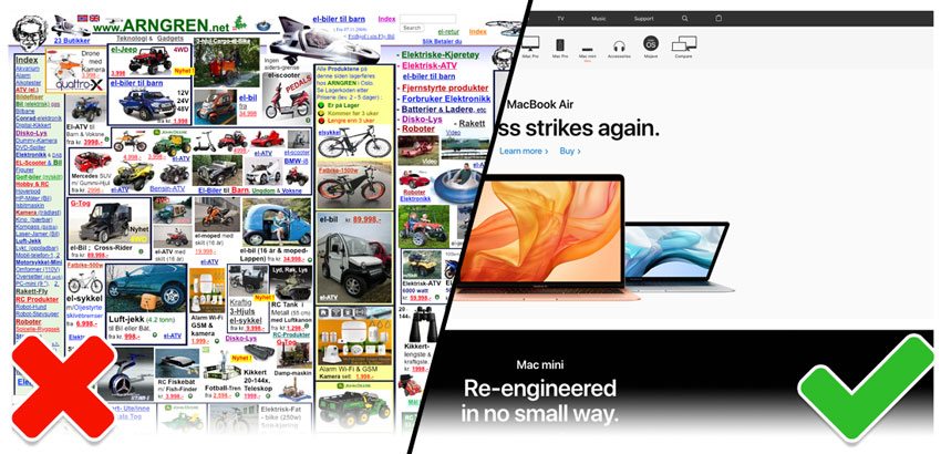
Keep it simple, clean, clear and above all -connected!
Well set out, clean and clear design enables the user to engage with the site better. Details can be easily picked out, calls to action are clearer and content is absorbed easier. For more info read our previous post about how you can boost sales with simple tweaks to your web design.
Your brand should shine on your site! It is the company’s image, how you want to look to your users, and how they will judge you upon landing on the site. Having everything connected and styled consistently means they will have a pleasant experience whilst visiting your site. Navigation, font usage, colour usage, buttons, links and other site elements all need to have careful consideration to how they sit within your brand. Similar to tone of voice, your visual presentation will show the user what sort of business they are dealing with. Whether it is formal, casual, or fun – you will be judged within milliseconds by the look of your website before the user has read a single word. You wouldn’t go to an interview in shorts and an old t-shirt just as much as you wouldn’t visit the beach in a tux! Your site is the same… it is YOUR image!
And finally, no one wants to arrive on a site and be faced with having to read “War and Peace” when a simple, well-headed paragraph can say the same. Sure, get into the details deeper into the site where a user would want more information, but main landing pages should be light, visually consumable by the user and enable them to navigate to the areas where the detail matters.
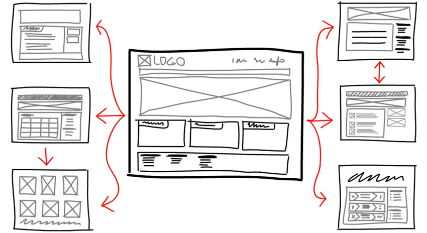
Consider your users journey
Where would you like your user to go? What do you want them to do at the end of their journey? These are things you will need to consider.
If you would like your users to easily access information about your business and then contact you, ensure your content is clear and well titled so everything is easily accessed at a glance. A strong call to action to the “Contact us” will enable the user to quickly communicate their requirements. You might have the best SEO in the world, but if your content is laid out badly, unformatted and no clear call to action then conversions will be hard to get and your users will fly away to more visually appealing pastures.

Imagery imagination
Too often imagery is an afterthought and any old stock image is thrown in. Stock imagery can have its place but more often than not it cheapens the site. Fake smiles and poses, fingers pointing at mocked up touch screens and faux 3d laser beam images that appear on thousands of websites does nothing for the uniqueness of your website. Having imagery that is on brand and personal to your business adds a visual unity and interest to your site.
If you have to resort to using stock photography consider a little image manipulation or creative cropping to make the image your own.
Hopefully this post provides some food for thought for businesses when re-designing a website, as we can’t over-egg the importance of having a well-designed site to secure conversions and provide a positive user experience.
