
Urban Element Are Wirehive Finalist for the Best Rebrand of 2018
18/09/2018 | Web Design | 10 minutesWe are delighted to have been chosen as a finalist for the Wirehive 2018 digital agencies awards. This year we have made the final shortlist of agencies vying for the “Best Rebrand of 2018” category, and its for the work we’ve carried out relaunching our own brand and website earlier this year. The entire team put a huge effort into making our own website a site that we feel now properly reflects us as a progressive digital agency. We’re keeping our fingers crossed for the final this October and are very proud of the entire team for their efforts getting us this far. Whilst we wait with bated breath for the results, here’s some (pretty detailed) insight into how we went about getting there.
When is it a good time to rebrand?
As a digital marketing and web development agency it’s often hard to stand out in an increasingly crowded marketplace. Over the last 12 months we’ve been asking ourselves some pretty difficult questions around identity, what “really” makes us different, and the direction that we want to be heading in the short, medium and long term. It’s also fair to say that, since our last website, brand assets, and company identity were created we’ve change – a lot.
With a lot of soul searching and self examination it became very clear that our existing brand was no longer a good reflection of Urban Element. We’d fallen into the trap of pushing boundaries, and creating great websites and brands for our clients, but overlooking our own website, voice, and brand, leaving it disconnected from the audiences we wanted to work with. Time for a rethink.
Fast forward to May 2018 – a relaunch, great feedback, and an award finalist to boot.
Following our usual branding and website development process we launched our rebranded and thoroughly redeveloped website in May earlier this year. We are delighted with how the new site carries our current positioning and voice, and feel this is a hugely improved reflection of who, and where we are as a team.
Affirmation that the rebrand has been a success has been the great feedback we’ve had from clients and partners. And to put the icing on the cake the Urban Element is now a finalist in the Wirehive “Best Rebrand of 2018” for our relaunched website site.
How we approached the rebranding Urban Element
When we initially sat down to discuss exactly what we wanted to achieve from a rebranded and new website the list was really very long. There was plenty of vested interested from all members of the team, so keeping a tight scope and focusing in on the more salient points was vital. Here’s how we approached the task.
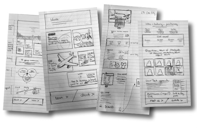
Planning & Design
Starting with the end point in mind…
Specific brand goals were set out during our consultation phase of the project. As a traditional B2B marketing agency we’ve tended to side on conservative branding in the past. With a fresher and more disruptive approach to our marketing services, it was important to reflect that within our new website rebrand. We decided to treat our own Managing Director, Natasha, as we would treat a usual client. Going through the same process as we would do for any of our usual clients. Key elements for Natasha were
- To evolve the perception of the company to match the type of clients and projects the company was now working with and pitching for.
- To accurately reflect a more refined and mature voice, using both visual and written languages. We understood that with a change in our client portfolio, there came a change in the type of language and brand perception expected by our potential customers.
- Evolution not revolution – recognition within our established market was also a consideration. Tonal palettes were extended and refined to introduce a meaningful, topic based colour scheme, and logo variations that fit seamlessly into favicons, varying shapes of Social Media badging, and across physical media.
- Bold and confident – the brand needed to give an air of confidence without arrogance. We believe that running with a stripped back text only logo where font choice is imperative displays this well. We’ve introduced conversational narrative and light hearted visual cues that help reinforce our authority and stature within the industry.
Creating an immediate visual impact
We wanted to create an immediate impact through visuals, one that would set us aside from what is a fairly uniform approach by other agencies. Feedback from clients, peers, and the marketplace has been excellent. We are delighted with the aesthetics of the rebranded web site and assets, achieving this through;
- Considered use of multi-layered parallax bringing depth to the home page, without distracting.
- Front end interactions that are key to the overall brand feel, with the level of subtlety carefully scrutinised throughout – not too much, but enough to show we have empathy for the end users’ satisfaction from the brand touch.
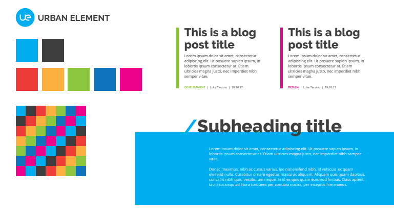
Creating harmonious colours that relate to the company brand
The primary and complementary colours have been chosen to evolve the previous brand. The primary blue has been lifted, and an expanded palette carefully chosen to both work harmoniously whilst having meaning throughout the rebranded website.
Making the site appropriate for our current audience
As our service offering has evolved, so too has the audience that we’re now talking to. Whilst our historical audience of smaller B2B businesses is, in cases, still relevant today, our growing client of larger, global businesses within both B2B and B2C demand a repositioning our messages and language. The main stakeholders our brand needs to talk to has also evolved, from majoritively small business owners, to senior marketing decision makers within businesses. With this our brand language has needed to change, with visuals and messaging addressing both business goals and strategic marketing objectives.
Creating an identity that differentiates us from the competition
During consultation we carried out extensive competitor research. We came to the conclusion that in a busy market place, there were considerable similarities between brands. Whilst we were happy to share some common approaches such as minimalism and clarity, we were keenly aware that developing a distinctive brand that differentiates us from the masses was key, particularly when the point of entry for projects largely starts with customers comparison shopping agencies. We have introduced a brave top down, almost “work in practice” approach to visuals and section breaks and narrative user prompts that are not used elsewhere.


Bringing innovation to the project
Use of emerging design trends
Strong typography and fonts have been a key element of the rebrand. With user interfaces becoming more stripped back and instruction focused, and with logos and visual element becoming less fussy, we’ve attempted to encapsulate that within our rebrand.
- Typefaces of Raleway and Open Sans have hugely elevated readability and a feeling of comfort and space across the website and printed material
- We’ve added subtle, well thought-through front end interactions, a continuing trend from the overtly and more brash front-end animations of recent years.
- Bolder and edgier photography has replaced the more traditional office shots or people busy at work, conveying a more vibrant and modern company perception.
- Responsive, flatter, and interactive logos keep the brand fresh and on trend for 2018 and beyond. They give a consistent, instantly recognisable feel on all viewports and across devices and technologies.
- SVGs have been widely used across the site, accommodating fast load speeds and sharp, consistent visuals.
- Flexible grids to seamlessly carry branded elements across the site have been utilised consistently
Improving the Urban Element brand from previous iterations and future-proofing from disruption in the market
Previous iterations of the brand have been very conservative and more appropriate to local business clients. Historically our branding, both in visuals and language has been mono-tonal, matter of fact and detail heavy. This had resulted in a reasonably stiff brand that gave the perception that we offered a safe, less daring marketing service. We feel that the new brand is brave and authoritative, a much better reflection of how “we” work in 2018. As we strive for larger clients, we see our approach to brand being the disrupter, rather than the disrupted.
Implementing the rebrand on site and beyond
The major public face of our brand is digital. Whilst our business cards, printed headers, and other literature have followed suite, its digital that has led our innovation. A thorough brand rollout of visual and content has been carried out across; our website, email signatures, all social media platforms, and our hosted collaborative tools that our clients interact with. The new brand has been communicated to clients and customers through email notifications, whilst the internal team are fully engaged with how to convey brand goal messages through their daily interactions with clients and the general public.
How our rebranded assets have been deployed
Many of our visual assets have been built using SVG formats for reliable scaling and performance. In order to minimise the volume of old brand assets in the wider digital environment, we have set up redirects on image URLs so that those being indexed and discovered are pointed to our new brand.
A consistent experience across platforms
All platforms, whether open to the general public, currently used by our clients, or used by prospects have had a consistent brand applied. Our social media platforms, and senior team member accounts have been rebranded with company logos, hero banners, and where appropriate, team photography.
Using best SEO practice
With our own marketing services firmly rooted in SEO we were very keen to make sure our visibility in search engines was optimised. We already ranked very highly for key industry terms so aimed to both consolidate our performing keyword universe whilst entering into new areas of searches that better suited our more expanded target audience. Amongst a full SEO rollout plan were;.
- Thorough content performance, competitor search analysis, and SERP benchmarking
- Link equity was evaluated and documented.
- URLs for pages and assets were mapped and redirected
- Meta descriptions and content was revised, repurposed, or created from scratch to accurately target identified keywords with traffic
- The site was correctly submitted and indexed progress followed by our SEO team.
We also took the opportunity to carry out a full keyword research and SEO exercise, and to resculpt content to better serve users and search engines across devices.
In summary…
We believe the rebrand has stayed true to our original brand values whilst having pushed well beyond the previous iterations. A thorough expansion of consistent assets and palette have opened up countless more visual avenues for our internal marketing team to build upon.
The rebrand is definitely more confident that the previous incarnations. Visual humour and a clear switch to warm, more assured content has delivered on both aims.
The type of conversations we’re now having with clients and potential clients have had a distinctively different feel. We’re now receiving more refined enquiries and have customers previously unaware of how we’ve evolved the team and service offering, now actively interested in how we can create more disruptive, braver activities for themselves.
