

Why All E-Commerce Sites Look the Same – the Importance of Affordance in Web Design
01/03/2018 | Web Design | 5 minutesThe eagle-eyed amongst you will surely have noticed the familiar traits shared by the majority of e-commerce websites these days. With a shopping bag icon in the top right-hand corner, and a category bar across the top leading to a drop-down menu, variation to the norm is limited in terms of website layout. These familiar clues in layout showing how a website should be used are known as affordances.
Our expectations
When shoppers take to the internet en-masse to buy a dress from ASOS or order their weekly Asda shop, a certain layout is desired. A search bar and login option are expected across the board, with online clothes shops in particular having even more in common, such as a large main image and filtering by size or price.
Familiarity is key
Research conducted by Google in 2012 into user preferences concluded that ‘users prefer websites with low visual complexity and high prototypicality’ and that ‘designs that contradict what users typically expect may trigger a suboptimal first impression and impair users’ expectations’. In short, a familiar structure is preferred and trusted more, which is vital when asking customers to enter their credit card details.
Simplicity and ease of user experience
A simple and familiar layout also caters to the less technical shoppers, reducing the likelihood of potential customers becoming frustrated and giving up before making their purchase.
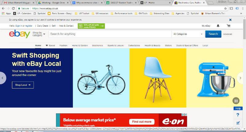
Using familiar labels and calls to action that are backed up by visual clues is a clear way to signify to the user their purpose. For example, it’s pointless having a carousel of images if users aren’t aware it’s a carousel. One way to make this clear is to have arrows on the sides of the images as demonstrated below.
Ecommerce vs brochure websites
Brochure websites differ slightly to ecommerce websites in that there is more room for a creative design layout, as the purpose is to provide users with information rather than a clear and familiar checkout process.
Functionality > aesthetics
Ultimately, when it comes to ecommerce sites functionality and familiarity is prioritised above creativity and aesthetics. This doesn’t mean that there is no room to be creative, just that it must be within certain restrictions in order to fulfil its ultimate purpose of allowing customers to easily select and purchase products.
