

Responsive Web Design: Understanding How Customers Use Your Mobile Site
12/12/2016 | Design | 10 minutesA recent survey by Ofcom1 showed that the the smartphone is now considered to be the most important device for internet access – particularly among 16–34 year olds. The average time spent online is also highest for mobile users. This demonstrates a huge change in how people use the internet, making responsive website design an even more important consideration.
The way that people use websites on mobile and tablets can be quite different from their approach on a desktop. The smaller screen size and touchscreen interface have changed the way that people interact. Your website needs to reflect this in order to appeal to this important audience.
The context in which your customers are browsing is also important to bear in mind. Mobile internet and portable devices have taken browsing away from the desktop. Your customers could be viewing your website at any time and in any place: on the bus, in bed or while out shopping. The tasks that they wish to complete in these contexts can be very different from those they would complete on a desktop or laptop PC at home or at work.
Understanding these differences is key to effective responsive web design and ensuring that your website meets the needs of your audiences.
What is responsive web design?
Responsive web design ensures that a website appears correctly and is usable on all types of devices; at all screen sizes and orientations. It uses fluid layouts, flexible image sizing and code that changes the style of the website depending on the screen size.
At Urban Element we use responsive web design for all of our website projects. We develop visuals for desktop, mobile and tablet that take into account the priority content on each page and user’s needs.
What’s different about mobile and tablet browsing?
Mobile and tablet users behave in different ways from laptop and desktop users. They are often looking for specific information, such as contact details or store locations. They want quick answers and lack the patience to wait for pages to load.
Users want to complete key tasks – and quickly
Taking the time to think about the key tasks for mobile users is an important aspect of responsive web design. This ensures that the content they need is easy to access on the device they are using. For example contact details can be placed at the top of the page for easy access. Images and code should also be optimised for mobile to increase loading speeds.
You can also make content easier to digest by following best practice for web content. Breaking content into blocks using subheadings and lists makes it easier to scan for all users, not just those on mobile and tablet.
Mobile browsers are happy to scroll, but clicking around is a pain
Users of mobile devices are happy to scroll. This makes scrolling through fewer, longer pages preferable to clicking through multiple pages. Think about the length of user journeys – how many clicks does it take to complete a task? Can content be grouped onto fewer pages?
Navigation is another important consideration for mobile and tablet users. Clicking on links or expanding navigation can be tricky. This makes it important to have clear calls to action and navigation that are easy to interact with for users without a mouse.
Get insight into how people are using your site on different devices
There are a number of different tools that you can use to understand how people are using your site on different devices. Learning from these and using this information to inform changes to your site can improve engagement and drive users to complete the tasks that meet your business goals.
Google analytics
Your website analytics are a great place to start. Google analytics will tell you which devices are being used to access your site and give you statistics on how each type of user is interacting.
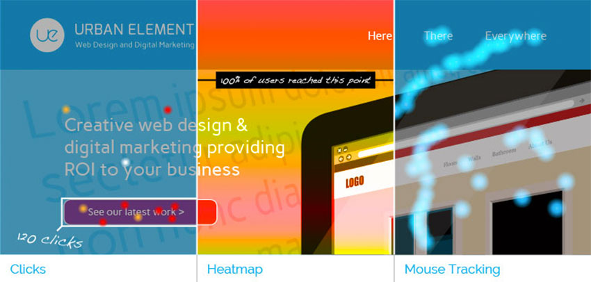
Heatmapping and visitor tracking tools
The next step is to look more closely at user’s journeys through your content. Heat mapping and other visitor tracking tools allow you to see in more detail exactly how user are interacting with your content. Some even create full recordings of user’s visits. This allows you to see exactly where people are having difficulty, or what’s working well.
Providing your users with a responsively designed website can improve their engagement with your site. This in turn can drive conversions and sales. Urban Element can support you with responsive web design, whether you need a new website or changes to your existing site. We can also provide a comprehensive user experience review to help you judge how well your website is performing. For more information, contact us.
1. The Communications Market 2016: 5 Internet and online content, Ofcom, 2016. First accessed 7 December 2016.
